

 Typography Reflection
The society derives its aesthetic values from the work of artists. The category encompasses the various styles that they use to present the writings on different materials. People prefer reading articles and viewing posters that are of appealing beauty. Moreover, they fancy most of the structures in the society to reflect the desirable outlook and appeal. Apparently, one cannot appreciate such beauty without recognizing the typographers behind them. Therefore, the paper explores the Kate Moross and Yusef Alahmad as typographers while highlighting their works, styles, and characteristics. Moreover, it focusses on constructivism as a design style that many artists have used over the time.
Kate Moross is a female typographer who has contributed to the field of design, illustration, and art direction. Moross resides in London where she has done a lot of typography to promote the art industry. Her contributions have led to many organizations profiling her including the Graphic Magazine and Vice Magazine among others. Moross uses varied styles in presenting her work include the use of diverse colors. Moreover, her work integrates hand-drawn elements, isometric and interlocking shapes, and patterns. Hand-drawn illustration and vector graphic work reflect her typography career. These styles ensure that the typographer remains the center of focus when dealing with different forms of art. Moross also works on a variety of designs including the productions of billboards and writing in various magazines. Moross' works remain no exception when it comes to typographical characteristics. Any person who claims to be familiar with her work would confirm three sided shapes and illegible typography as some of the characteristics she uses. Additional, Moross is fond of freeform lettering while working on most of her typographies. The combinations of such styles and characteristics make many people admire and prefer most of her works. As a result, Moross has achieved much than one could imagine despite her tender age.
The next typographer who forms part of this analysis is Yusef Alahmad. Alahmad is an Arabic typographer, a Saudi graphic designer whose works remain admirable to many people in the society. Apart from being a graphic designer, Alahmad doubles as an artist. Despite being Arabic, he is based in San Francisco, California. Yusef does most of his work as a freelancer, and this move has made his work to feature in various media. Some these print platforms include Print Magazine and Baseline Magazine among others. Yusef also uses various styles to make his work appeal to the end users. The typographer prefers using different colors to make his work admirable. Being colorful proves one of the styles that have made Yusef to remain of value to his followers though his works. In reality, people prefer typography to present the best aesthetic appeal to the people who value it in the society. The proper combination of colors while presenting any typographic product makes it visible and one can isolate its nuances easily. Therefore, being colorful is one style that has made Yusef to penetrating the typographic market. Furthermore, his work contains characteristics that prove to make them exceptional. In most of his typographic presentations, Yusef uses Arabic typography and patterns. One could conclude that such characteristics give him a sense of belonging if not identity. In fact, Yusef is Arabic hence one can attribute the use of Arabic typography and patterns to his identity. All these styles and characteristics contribute to the meaning of typography in his design. It is on such grounds that he has had the chance to interact with many organizations through the social platforms. Moreover, many people have found his typographic work useful and attractive to them.
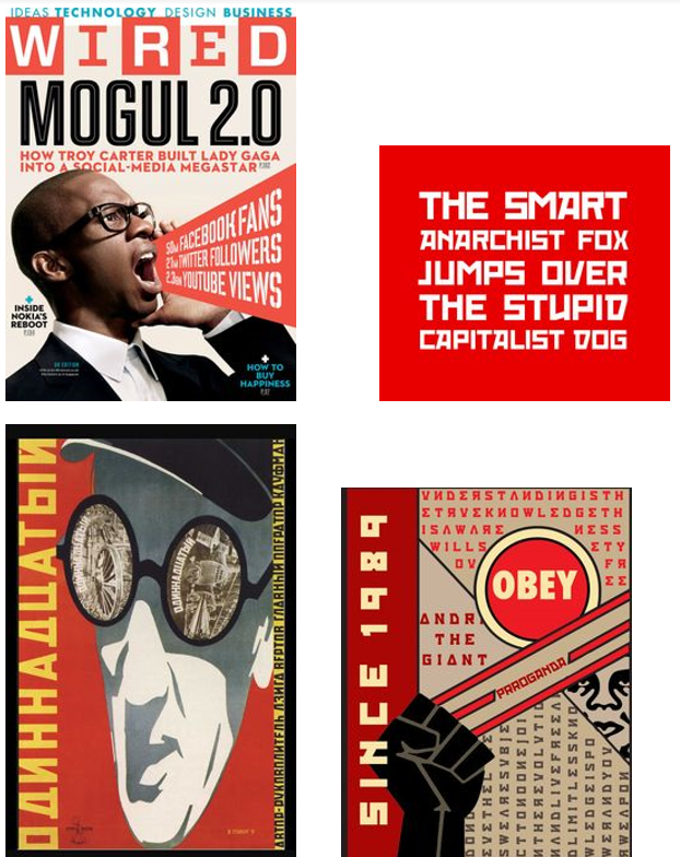
The next aspect of this discussion focuses on the design style, especially the constructivism deign movement. It is a form of artistic and architectural philosophy that originated in Asia. Before the existence of constructivism, artists used what one could easily describe as autonomous. The process did not involve any construction of art since it followed predetermined procedures. Vladimir Tatlin wanted to see art that is based on construction and the one that serves the social purposes. As a result, constructivism remained pervasive concerning its influence, and it contributed to the development of many areas of art including graphic design and industrial design among others. The beginning of constructivism focused on festivals and street designs. It served such functions with the intention of advocating for the construction oriented form of art. The constructivism approach aimed to make the viewer active. Artists can achieve these goals by making their artwork strange hence appealing to the viewers. In many cases, people find interest in what appears to be unique. As a result, they remain eager of getting information regarding such typographic pieces. It is during such process that viewers become active to solicit for the relevant information. Moreover, constructivism also aimed at making the artists to perform a technical analysis of the modern materials. The process would give then an insight into their work. As a result, they would use such skills to construct art as opposed to the autonomous approach. More so, the study intended to yield information that proved relevant to modernizing the art industry. Constructivism aimed at providing the society with the artwork that is satisfactory from many perspectives. It is following such demands that the founders saw the need to abolish the traditional approach and follow the modern procedures in creating artwork.
Constructivism combines a variety of colors and imagery including red and white. It then requires artists to combine such colors in a manner that they make the viewers active. Pragmatically, color combination makes any artwork to live to the meaning of art. It is what enables the viewers to isolate various distinct features of the design. Constructivism also uses sizeable images with proper visibility to enable viewers to make sense out of the artwork. Another aspect of constructivism is the type face that it uses.
Most of its typefaces include Kroftsmann, Kremlin Alexander, 10 Cent Soviet, and Castro among others. The design recommends such typefaces to allow for a clear presentation of the work that an artist intends to the viewers. Its design elements like the Utopian allow for the use of different font sizes in presenting any typographical work. Constructivism structure is a three dimensional concept. It uses clean lines and pure shapes in developing art. Additionally, it applies flat colors and formal order of developing typographical work hence appealing to the viewers. These factors contribute to its layout. Also, its composition includes using definite fonts and color contrast. Apparently, the philosophy that ignited the need for constructivism was the idea of constructing art. Moreover, it aimed at presenting a different attraction to the society by fulfilling most of their needs.
Some of the constructivist posters are as below.
In conclusion, typography is one field that holds a lot of meaning to the society than one could imagine. It is following such facts that the paper finds it vital to analyze some typographers who continue to contribute to this field of knowledge. Kate Moross and Yusef Alahmad have contributed and continue to contribute to the field of typography. Many people interact with their work in both print and non-print media. They are such colorful and attractive typographical pieces that make their products prolific. Finally, constructivism is also a design style that has proved essential to this discussion. Its background, colors, type face, layout, and composition all prove relevant to the analysis.

